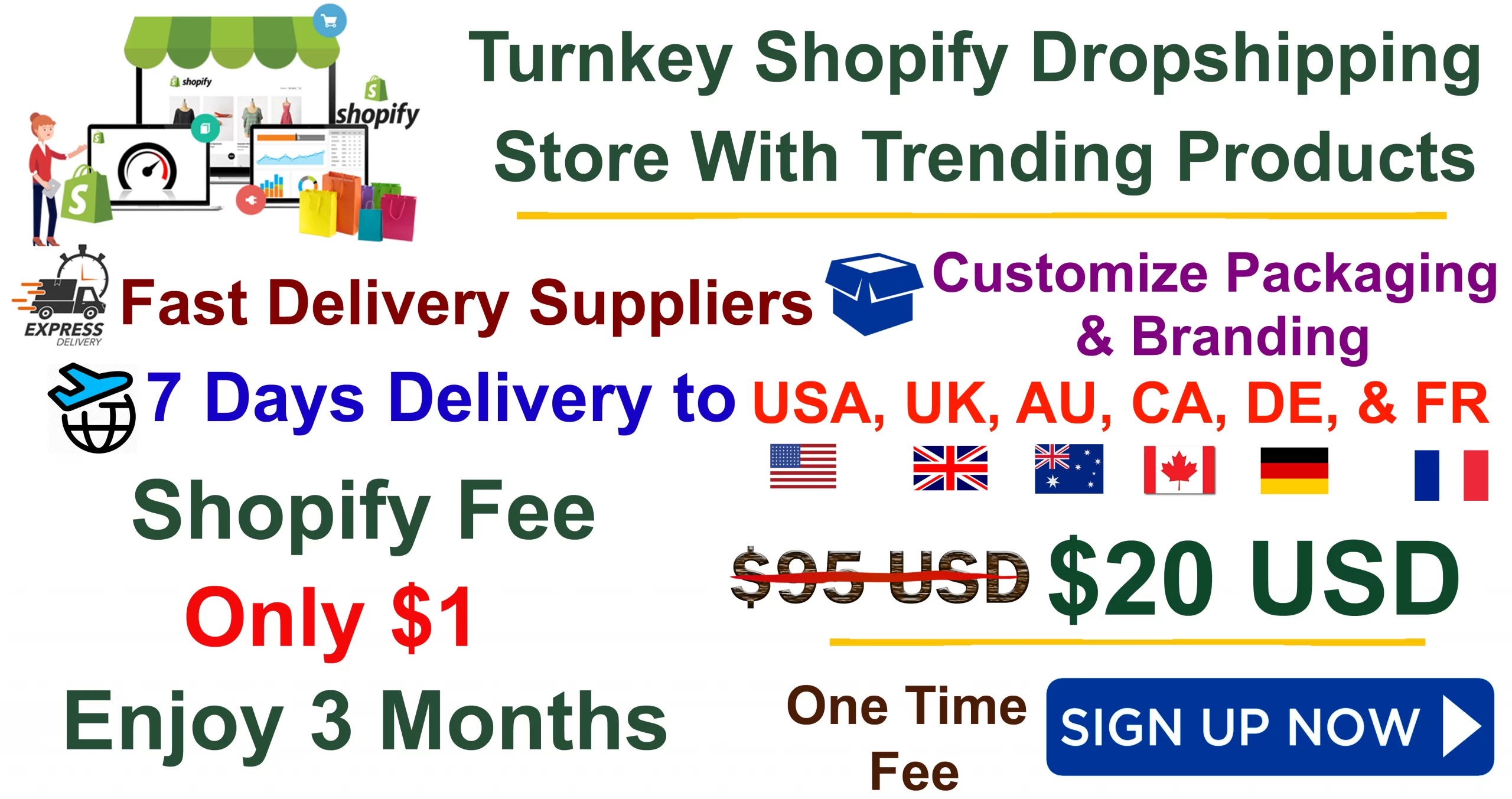
The importance of a banner image on a product page cannot be overestimated. It is the first thing that a customer sees when they visit your page, and it can make all the difference in whether they stay to browse or click away.
Banner images should be high-quality and relevant to the product they are promoting. They should also be placed above the fold, so that customers don’t have to scroll down to see them.
Shopify offers a number of great tools for creating banner images that are sure to capture your customers’ attention. With a little bit of effort, you can create banner images that will help increase your conversion rate and boost your bottom line.
How to add a banner image to your product page on Shopify
Adding a banner image to your product page is a great way to make your products stand out. A banner image can help you highlight a special offer or promotion, or simply add some visual interest to your page.
Adding a banner image to your product page is easy with Shopify. Simply go to the “Edit HTML/CSS” section of your theme, and upload your banner image to the “assets” folder. Then, add the following code to the “product-template.liquid” file:
{{ ‘banner.jpg’ | asset_img_tag: class=’banner-image’ }}
Be sure to replace “banner.jpg” with the name of your actual banner image file. That’s it! Now when you view your product page, you should see your banner image at the top of the page.
Why you should add a banner image on Shopify product page
Adding a banner image to your product page on Shopify can be a great way to make your product page more visually appealing and help it stand out from the competition. A banner image can also help to highlight key features or benefits of your product, which can be especially useful if you have a lot of text on your page.
How to make your banner image stand out on your product page on Shopify
The banner image on your product page is one of the first things that potential customers will see, so it’s important to make sure that it’s eye-catching and relevant to your product. Here are some tips on how to make your banner image stand out:
1. Use high-quality images: This is especially important if you’re selling products that are visual in nature, such as clothing or home decor. Make sure to use clear, sharp images that accurately represent your product.
2. Use relevant keywords: When potential customers see your banner image, they should be able to immediately tell what your product is and what it does. Use relevant keywords in your banner image alt text to help them understand what they’re looking at.
3. Use a strong Call-to-Action (CTA): Your banner image should have a strong CTA that tells potential customers what you want them to do next, such as “Buy Now” or “Learn More.” This will help guide them through the purchase process and increase your chances of making a sale.
By following these tips, you can make sure that your banner image is working hard for you and helping to boost your sales.
Conclusion
Your product page banner image is important because it’s one of the first things customers will see when they visit your page. Make sure your banner image is high quality and represents your brand well. Keep in mind that you can always change your banner image if you need to, so don’t stress too much about getting it perfect the first time.

