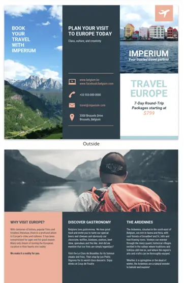
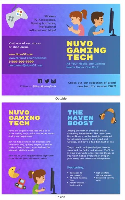
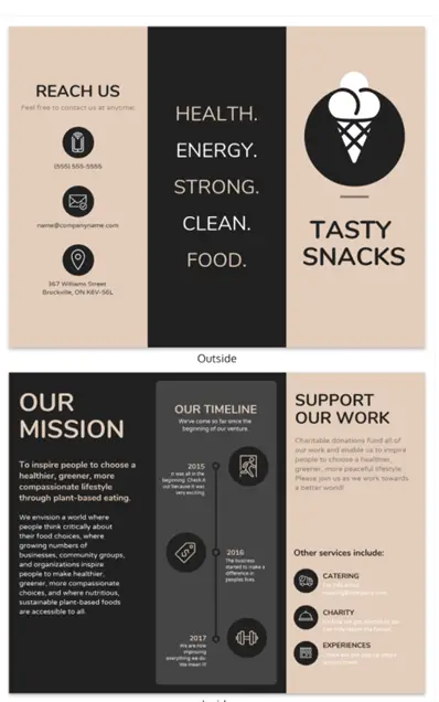
The success of your business depends on your ability to communicate with the public. A hand full of marketing tools can do this, and brochures are one of them. Brochures continue to be an effective way to introduce a new company or product, promote services and open up new revenue streams in emerging markets.
However, it is not just printing a piece of paper and throwing it out to the world; there must be some thought placed in what you want your intended audience to take away from the brochure design. Here’s a list of ideas to consider:
1. Mix up your brochure design
With so many options for designing and formatting your brochure, begin by creating prototypes that include different layouts, color themes, and information architectures (i.e. tabs, indents, etc.)
2. Give your reader instant value
When designing a brochure, consider how you can establish an emotional connection with the audience; make them feel like they need to know more about your product or service.
Whether it is through callouts and catchy phrases or icons and representative drawings, placing key messages throughout the design will help create an effect that urges the viewer to read and understand what you’re selling.

3. Don’t just sell your leaflet design- tell a story
People remember stories; we’ve been using storytelling techniques since caveman times to communicate important information that’s not only memorable but also valuable in our lives today.
A great way to sell on any level is by telling a personal story of someone who was able to overcome a challenge and achieve success by using your product or service.

4. Stand apart from the crowd
It is important that your brochure design truly stands apart from a sea of other direct mail pieces, business cards, and advertisements that people come across every day. If you want to be successful in promoting your business, then make sure it’s not only designed well but also easy on the eyes.
A new way to accomplish this is by making use of technology such as QR codes, social media branding tags, and video links embedded within the layout.
5. Be consistent with your company brochure design’s messaging/branding
In order for a design concept to have long-lasting effectiveness, consistency is key: think about logo placement, color schemes, and fonts that tie into the overall identity of your business.
6. Use visuals to attract attention
Designers can create a brochure design by using visuals in an almost limitless number of exotic and creative ways; appeal to the 5 senses and make it memorable: use bright colors, themes, and imagery that stand out from other marketing pieces and leave a lasting impact on the reader. Also, be sure to showcase information about your company in such a way that’s intriguing enough for people to want more.
Need some professional-looking brochure templates? Just head on over to Venngage, the hottest brochure maker in town, and start churning out designs effortlessly.
7. Keep things simple yet effective (Use a brochure maker!)
Just because there are many options when designing a brochure layout doesn’t mean that you should go all out with tons of graphics, photos, and text. Especially if you’re trying to sell something quickly or capture potential clients’ attention, you want to make sure that your message is concise and easy for people to understand.
A simple design with only the most important information will help grab someone’s attention more than a brochure that has too much information on it.

8. Design your brochure layout around your audience
There are different types of clients out there, so keep in mind who you’re designing for when creating a layout. Who knows better about their intended audience-you or them?
9. Test designs before production
This is an initial step that should be taken seriously; ask yourself if the design communicates exactly what needs to be said without any confusion or misinterpretation on the viewer’s part. Make use of online tools, coloring pages, and images that are provided by the printer to see how the design will look like a printed piece.
10. Don’t be afraid to make it work
If you don’t like the design but still want to use it- go for it! The point of creating a brochure is to attract clients; if there’s even a small chance that your layout will achieve this, then it’s worth using. Also, remember that what you think may not always communicate with others; sometimes taking risks can result in winning big.
10. Let it be your own
Don’t try to imitate other designs that you’ve seen or worked with before; this is your business and your brand, so make it work for you. Have fun and challenge yourself by experimenting with new ideas and concepts so that you can bring something new to the table each time!
Conclusion
When designing your brochures, keep these tips in mind and choose one or two ideas to implement each time you create another version By experimenting with different layouts, you can produce a wide range of interesting, creative brochures that offer your viewers more than just information.

